Petra Kemkova
Illustration Agent & CEO of Illustration Agency OWL
Having worked with many artists over the years for many agencies and brands, sometime I don’t realise how alienating might sound our jargon or as my mum says over and over: “Speak my language, dear.”
So my personal goal for this case study is to not only explain the process of working with an illustrator, but also explain difference between, sketches, drafts, roughs and rounds ;D
Case Study: Judit Zengovari for Harry's x Talkspace campaign
Duration:
1 month
Client:
Harry’s
Harry’s is an American company that manufactures and sells shaving equipment and men’s personal care products via online and retail channels. The company is known for their subscription service where customers receive new razor blades, shaving cream, and other grooming products by mail. Harry’s is based in New York.
Illustration Agency:
Illustrator:
Project Overview:
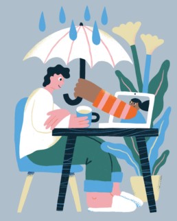
We were asked to create set of visuals for digital collaboration campaign between Harry’s and Talkspace. Follow this link to learn more.
At Harry’s, we believe in better access to mental health care. That’s why we’re teaming up with @talkspace, an online therapy company, to create a series of posts designed to help you assess and prioritise your own mental health.
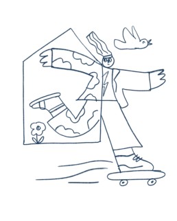
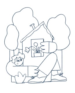
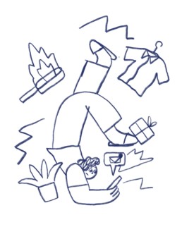
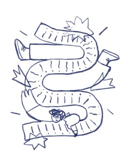
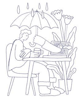
Drafts, roughs and sketches
… are essentially the same thing. When working with illustrator, it’s always good start to ask for drafts or ideas that are roughly sketched. Good collaboration can be achieved by the process where one can see options.
Once you get sketches, you get...
1/ ideas in visual form – where you’re able to catch up possible meaning discrepancies between what you can read from the image and what you want to communicate.
2/ visual stylisation – tone of communication, it’s like whether you are being serious in a conversation or whether you used satire to lighten up the mood.
3/ position of objects – at this point a graphic designer can already place the image into the design to see how the layout came out.
Build your own art department
Some of the best artists who would love to work on your projects are on the other side of the globe. At Owl Agency will help you to find them and make them part of your remote team.


Incorporating feedback
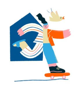
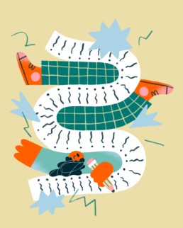
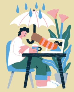
Feedback is being incorporated in rounds. You comment on the draft, illustrator incorporates your changes, sends it back to you for a review. And the process repeats. Normal non-complicated process consist of one-two feedback rounds.
Requested changes could be anything from moving a leg to colour combinations – sometimes clients request their own “brand” colour palette, sometimes they need darker bg for better visibility of overlaying text.
And that’s how the illustration is born. Enjoy!
"Hi, I'm Petra, an illustration agent. If you feel like, you can get in touch with me to consult your illustration project."
+421 949 774 225
Thanks for your attention. And don’t forget to come to Owl Agency or Minty to create your illustrations.
Interested in more visual trends? Create account on Minty, start discovering illustrators and their work and get updates about latest illustration trends.
Here Are 6 Award Winning Illustration Styles That Worked For Global Brands
Click On Style To Discover More
Three Kinds of Messaging for Pride Month 2025
Pride Month—celebrated every June to mark the anniversary of the 1969 Stonewall uprising—has grown…
Protecting Your Illustrations: How to copyright your art in the age of AI.
With the rise of the new version of OpenAI’s ChatGPT image generator, many of our fellow…
Spring Illustrators: The Power of Nature
Spring is finally here! ? The days are getting longer, the air smells like fresh blossoms, and…
Three Female Illustrators Making Their Mark
In the vibrant world of illustration, talent knows no boundaries. Today, we’re shining a…

